Welcome to my blog, where I’ll dive into the essential elements of layout and composition in technical writing. In today’s fast-paced world, clear and effective communication is crucial, whether through the written word, visuals, or presentations. This blog stems from my exploration of the core principles that underpin successful communication in various professional contexts.
Throughout my technical writing course, I’ve learned how to tailor content to specific audiences and purposes, crafting everything from effective business correspondence to comprehensive reports and clear technical instructions. The course emphasizes not only the written word but also the importance of visual design and oral presentations, allowing us to create documents that are both informative and engaging.
In this space, I’ll share insights and strategies that highlight how visual communication plays a pivotal role in enhancing clarity and improving user experience. Together, we’ll explore the art and science of creating impactful documents that resonate with readers and effectively convey complex information. Join me on this journey to unlock the potential of visual communication in technical writing!
Overview
Effective technical writing relies heavily on the essential design guidelines to ensure that information is presented clearly and cohesively. While many may think of design as merely adding pictures or decorations, it encompasses much more. The basic principles of effective design, such as alignment, contrast, repetition, and proximity (often summarized by the CRAP acronym), are essential for creating documents that not only look professional but also enhance understanding. Thoughtful layout and composition unify the material, emphasize key points, and facilitate navigation through the document. By adhering to format requirements—such as double-spacing, appropriate paragraphing, and consistent font usage—writers can create documents that meet professional standards and enhance readability.
The tools of design, including color, font, whitespace, and graphics, play a vital role in conveying information effectively (“Beginning Graphic Design: Layout & Composition,” n.d.). Design elements for communication are crucial; color can highlight important sections or differentiate between topics, while whitespace reduces clutter and allows readers to focus on the content. Additionally, an understanding of beginning graphic design principles empowers writers to make informed choices about layout and visual elements. The use of templates—whether blank or pre-designed—can streamline the writing process, providing a structured framework that maintains consistency throughout the document. By combining fonts effectively, writers can create visual hierarchy that guides readers through the material. By integrating these design principles, technical writers can craft layouts that are not only visually appealing but also serve to clarify and enhance the communication of complex ideas.
Understanding Essential Design Guidelines
Technical writers often engage in a wide range of projects beyond traditional technical manuals. Their responsibilities can include crafting business proposals, managing social media platforms, and developing websites. They may need to sell or explain products, promote events, announce new programs, write articles, or even solicit donations for various causes. Additionally, they might be tasked with creating various materials such as flyers, posters, brochures, pamphlets, or menus. Given the diverse expectations in the job market, a solid understanding of visual design principles is crucial for effective communication.
Figure 1
Key Concepts to Consider when Designing
| Principle | Description |
| Audience | Identify the users of your materials and understand their background, language, education, and familiarity with the subject. |
| Purpose | Clarify the intent of your document (e.g., policy manual, procedural guide, promotional material). |
| Style Guides | Familiarize yourself with company-specific language and formatting, as well as recognized style guides like AP, MLA, or APA. |
| Writing Style | Tailor your language to the document type, using formal language for technical documents and informal language for promotional materials. |
| Layout | Apply visual design principles for easy navigation and flow, utilizing whitespace and emphasizing important information. |
| Content | Ensure clarity, conciseness, and accuracy, delivering information without requiring additional clarification from the reader. |
Note: Data adapted from Smelser-Gackler (2024).
Essentials of Communication Design
When approaching page design, it’s beneficial to adopt the perspective of professional graphic designers who identify six fundamental elements that contribute to effective communication. First, text forms the backbone of any document, comprising the paragraphs and sentences that convey the core message. Additionally, headings and titles serve as important labels that organize content into sections, guiding the reader through the material. The incorporation of graphics—such as drawings, tables, photographs, and their accompanying captions—enhances the visual appeal and helps illustrate key points (Smelser-Gackler, 2024).
Another critical aspect of design is white space, which refers to the blank areas on the page that provide breathing room for the content and improve readability. Headers and footers also play a vital role in multi-page documents, often containing useful information like page numbers and document titles. Finally, the physical features of the document, including the size and shape of the paper and the type of binding used, can significantly impact how the communication is perceived. By thoughtfully considering these elements, writers can create well-structured and visually engaging documents that effectively communicate their intended messages (Smelser-Gackler, 2024).
The Art of Planning and Choosing Graphics
Effective graphic design begins with careful planning and thoughtful selection of visuals. First, it’s essential to pinpoint areas where graphics can enhance the usability of your communication. Consider how visuals can clarify complex information or break up dense text to make the document more engaging. Additionally, identify opportunities where graphics can bolster the persuasiveness of your message. However, be mindful to place graphics thoughtfully; avoid disrupting the flow of the document by inserting them between paragraphs or at logical breaks to maintain coherence. Once you have identified potential locations for graphics, the next step is selection. Choose graphics that best support your readers’ tasks and help convey your main points. It’s crucial to consider how different types of graphics can influence your audience’s attitudes and perceptions. The selected visuals should not only complement your arguments but also effectively support your case, creating a more impactful document (Anderson, 2024).
Visual Impact: Designing for Clarity and Color
When designing user-friendly graphics, prioritize clarity and ease of understanding. Ensure that your visuals are straightforward and assist your readers in completing their tasks. Keep the design simple by labeling each graphic clearly and providing informative titles. It’s also beneficial to include a brief summary or caption that addresses the main takeaways from the graphic, ensuring that your audience can quickly grasp the relevant information without confusion. Additionally, color plays a vital role in graphic design and should be used strategically to support your message. Use color for emphasis rather than decoration and choose a cohesive color scheme that enhances overall communication. Ensure high contrast between text and background to improve readability and select colors that carry appropriate associations. Limiting the color palette can create a unified look, helping to draw attention to the key points in your document (Anderson, 2024).
Integrating Graphics with Ethical Care
Integrating graphics seamlessly is crucial for effective communication. Introduce each graphic in the text beforehand, guiding your readers on what conclusions to draw. Provide all necessary explanations to ensure your audience can understand and utilize each graphic effectively, and position graphics close to their corresponding references to facilitate easy navigation and comprehension. Additionally, ethical considerations are paramount when using graphics. Avoid misleading elements that could confuse your readers, and always obtain permission for any copyrighted images that are not in the public domain. Acknowledge all contributors to the graphic’s development and ensure that each visual adds value to the document rather than unnecessary clutter. By adhering to these ethical guidelines, you can enhance the overall quality of your communication (Anderson, 2024).
Layout and Composition Unsung Heroes of Design
When it comes to layout and composition in technical writing, the key to success lies in thinking like a designer. As discussed in the following video (LearnFree, 2022), effective design goes beyond aesthetics; it involves understanding and applying five fundamental principles that can dramatically enhance the clarity and impact of your documents. First, proximity emphasizes the importance of grouping related items together, allowing readers to easily make connections between concepts. Second, the use of white space, or negative space, is crucial for creating a clean and organized look, helping to reduce clutter and enhance readability. The third principle, alignment, encourages writers to imagine their content arranged within a grid, promoting a structured and cohesive layout. Contrast, the fourth principle, involves differentiating elements to create emphasis and draw attention to critical information, utilizing size, text variations, hierarchy, and color. Lastly, reinforcing a consistent look and feel through repeated elements—such as a defined color palette—ensures a harmonious presentation throughout the document. These principles of layout and composition are the unsung heroes of design, playing a vital role in making technical writing more engaging and effective for readers. In the following video, we’ll explore these concepts further and see how they can transform your technical writing projects (“Beginning Graphic Design: Layout & Composition,” n.d.).
Follow these Steps to Great Design
Planning is the key to great design, answer these questions about the function of your material:
| Who is your audience? |
| What format works best? |
| Where will it be seen? |
| How will you share it? |
| Have you drafted, proofread, reviewed and finalized your material? |
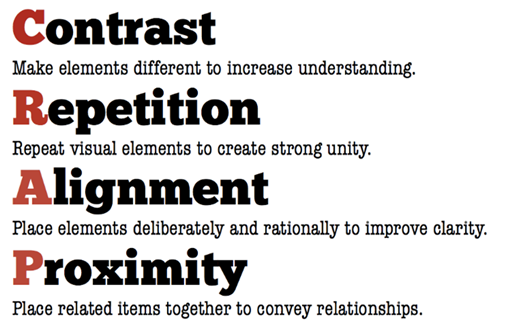
Understanding CRAP: A Framework for Design Principles
In the realm of design, the acronym CRAP serves as a powerful framework to guide effective layout and composition. Standing for Contrast, Repetition, Alignment, and Proximity, CRAP encompasses key principles that can transform your technical writing into a visually appealing and coherent experience. Contrast helps distinguish different elements and creates emphasis, making important information stand out. Repetition reinforces a consistent look and feel, ensuring that similar elements echo throughout the document, which enhances cohesion. Alignment promotes a structured layout by organizing content along a common axis, leading to a clean and professional appearance. Finally, Proximity involves grouping related items together, helping readers easily navigate the information. By applying these principles, writers can enhance clarity, engage their audience, and deliver messages that are not only informative but also aesthetically pleasing (Smelser-Gackler, 2024).
Note: Data adapted from Smelser-Gackler (2024).
Selecting the Best Font
Choosing the right font is a crucial aspect of effective communication in technical writing. Fonts can significantly influence how information is perceived and understood, impacting everything from readability to the overall tone of the document. The right font not only enhances clarity but also helps convey professionalism and trustworthiness. When selecting a font, it’s essential to consider factors such as legibility, appropriateness for the audience, and alignment with the content’s purpose. By understanding the nuances of typography, writers can elevate their documents and ensure that their messages are communicated effectively. For more insights on this topic, check out this helpful resource on selecting the best font (Cowen, 2024).
Elevate Your Technical Writing with These Free Templates
When it comes to technical writing, using templates can be a game changer. They provide a structured framework that helps ensure consistency, clarity, and professionalism in your documents. Whether you’re crafting reports, presentations, or user manuals, the right template can save you time and effort, allowing you to focus on the content itself rather than the formatting. Fortunately, there are numerous free resources available online that offer a variety of templates tailored to different types of technical writing projects. These sites can help you streamline your workflow and produce high-quality documents with ease. Let’s explore some of the best free template resources that can assist you in your technical writing endeavors.
List of free Templates
Brochures
https://www.canva.com/create/brochures/
Adobe Express is world-renowned. Take advantage of their expertise.
https://www.adobe.com/express/create/brochure
Microsoft (you are Office 365 subscribers)
https://templates.office.com/en-us/premium-templates/brochures
Graphics
Check out these: https://unsplash.com/s/collections/wiki-commons
https://99designs.com/blog/resources/public-domain-image-resources/
Note: Data adapted from Smelser-Gackler (2024).
Key Takeaways
In the world of technical writing, effective design is more than just aesthetics—it’s a critical component of clear and efficient communication. By understanding and applying fundamental principles of layout and composition, such as alignment, contrast, repetition, and proximity, technical writers can create documents that not only look professional but also enhance readability and comprehension. Graphics, color, and thoughtful design choices support the content, making it easier for readers to navigate complex ideas. Ultimately, the goal is to ensure that every element—whether it’s text, graphics, or layout—serves the purpose of making the information accessible, engaging, and easy to understand. By integrating these design principles, technical writers can craft materials that are not only informative but also visually appealing and user-friendly.
References
Anderson, P. V. (n.d.). Technical communication: A reader-centered approach. Retrieved from https://en.wikibooks.org/wiki/Professional_and_Technical_Writing/Design/Usability
Beginning Graphic Design: Layout & Composition. (n.d.) GCFGlobal. https://edu.gcfglobal.org/en/beginning-graphic-design/layout-and-composition/1/
Cowen, K. (2024, October 29). Choosing the right fonts for your graphic design projects. Creative Boom. https://www.creativeboom.com/tips/choosing-the-right-fonts-for-your-graphic-design-projects/
LearnFree, (2016, November 22). Beginning Graphic Design: Layout & Composition [Video]. Youtube. https://www.youtube.com/watch?v=a5KYlHNKQB8&t=14s
Smelser-Gackler,L. (2024, October 29). Week 3: Design Basics [Lecture notes]. EN261 Technical Writing, University of Arkansas Grantham.